✦ Live Demo

Your brand book,
alive and clickable.

This is what your clients get when a project wraps — not a PDF they'll lose. A living document they can always return to. Scroll around. Click things.

Create yours free →
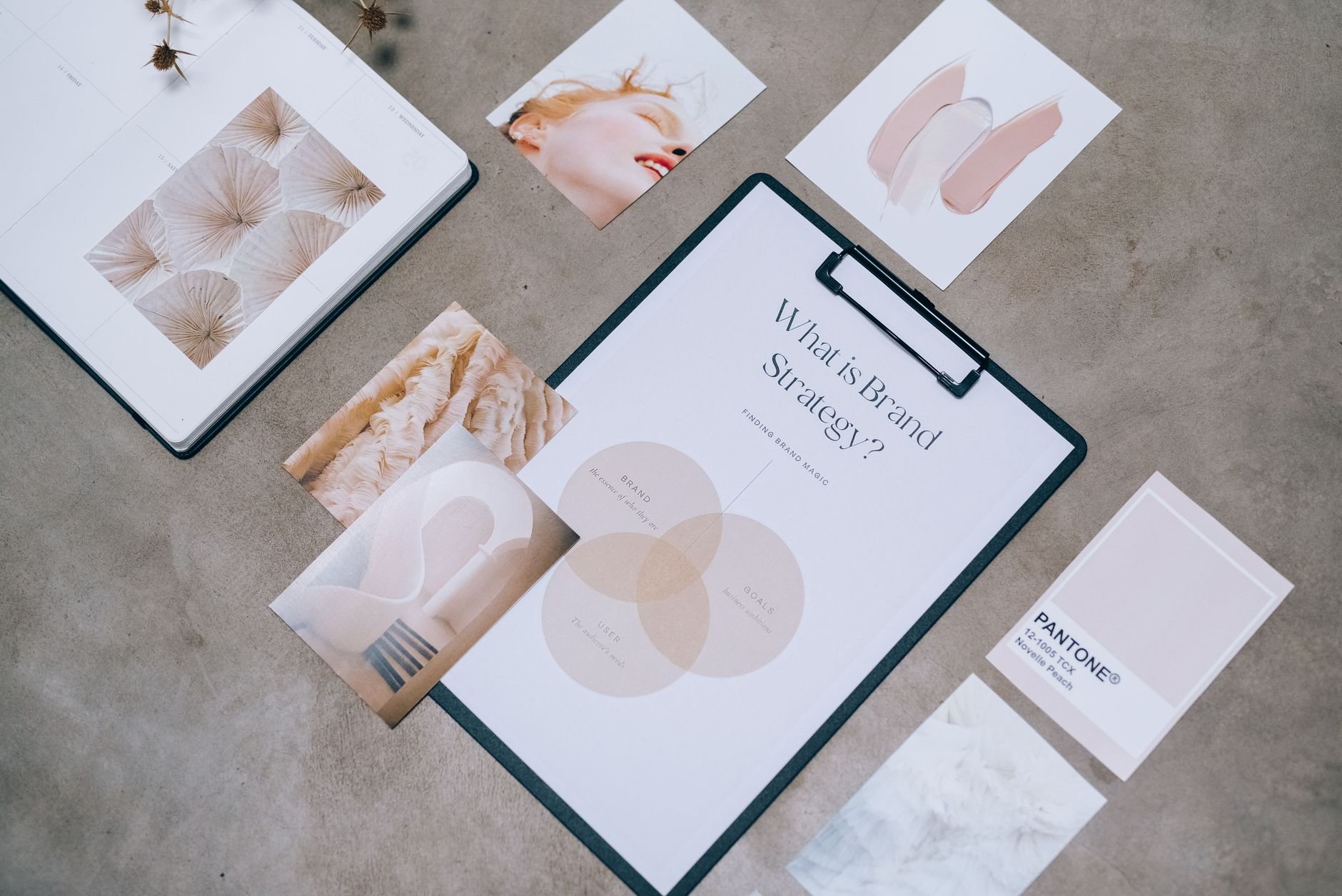
Verdant Studio Brand Identity · Delivered by Brandhand
Flat lay showing branding materials and design concepts for creative strategy discussions.

Verdant Studio

Where nature meets narrative

Founded
2024
Industry
Sustainable Lifestyle
Target Audience
Conscious Consumers, 25–40
Brand Personality
Grounded · Aspirational · Honest
Mission Statement
"We help people live lighter — in their homes, their wardrobes, and their choices."

Colour Palette

Click any swatch to copy the hex code.
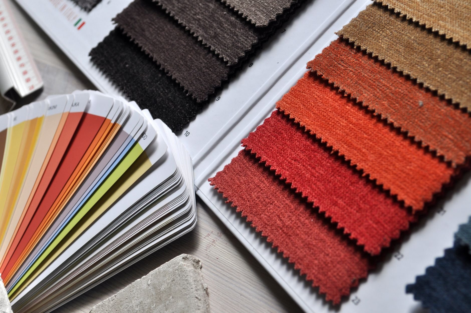
Close-up of fabric swatches and colour palette, ideal for interior design and textile projects.

The palette draws from forest floors and morning mist — deep greens that feel permanent, sage tones that feel approachable, and cream whites that breathe.

The primary green appears on all hero moments. Never pair the two dark greens directly — always separate with a neutral.

Forest #1B4332 Primary
Click to copy
Canopy #2D6A4F Secondary
Click to copy
Fern #40916C Accent
Click to copy
Moss #74C69D Tint
Click to copy
Mist #D8F3DC Background
Click to copy
Cream #F8F4EF Neutral
Click to copy
Copied!

Typography

Drag the slider to preview sizes across the type scale.

Display · Playfair Display
Where nature meets narrative.
Serif · Bold · Used for: Hero headings, chapter titles, pull quotes
Body · DM Sans
Our products are made from natural materials, ethically sourced and designed to last. We believe good design and responsible production aren't mutually exclusive — they're inseparable.
Sans-serif · Regular/Medium · Used for: Body copy, captions, UI labels
Size preview
Verdant Studio
✓ Do pair
Bold statement. Supported by calm, readable body copy in DM Sans.
✗ Don't use
BOLD STATEMENT. All-caps display type dilutes the elegance of the brand voice.

Imagery Style

Toggle between approved and unapproved examples to understand the visual language.

Flat lay of branding materials
✓ Natural light · muted tones

Use imagery with soft, diffused natural light. Backgrounds should be neutral — cream, linen, stone.

Close-up textures and fabric swatches
✓ Texture · materiality

Close-up shots of textures, materials, and surfaces reinforce the brand's tactile, grounded identity.

High-contrast · neon · artificial light
✗ Avoid neon or harsh lighting

Overly saturated imagery feels synthetic. Verdant's story is authentic, natural, and grounded.

Stock-style · posed · fake smiles
✗ Avoid generic stock photography

Posed, artificial people shots feel hollow. Use real environments, objects, and candid moments instead.

📐
Aspect ratio rule: All hero images should be 16:9. Product close-ups: 1:1. Editorial features: 4:5 for mobile, 3:2 for desktop.

Voice & Tone

The brand speaks. Here's how it sounds.

Grounded
Warm
Honest
Aspirational
Playful
✓ We say this
"Made from one material, start to finish. No blends, no shortcuts."

Specific, confident, no fluff. The honesty builds trust faster than any claim.

✗ Not this
"Premium quality products crafted with passion and sustainability in mind!"

Vague, over-excited. Every brand claims passion. Show the specifics instead.

✓ We say this
"It lasts longer than the trend. That's the point."

Opinionated without being preachy. States a value without lecturing.

✗ Not this
"Join us on our journey to a greener tomorrow!"

Clichéd sustainability language. It means nothing specific and people tune it out.

Instagram
Quiet confidence. Let the image do 80% of the work. One short, punchy caption.
Email
Conversational but considered. Like a letter from someone who knows what they're talking about.
Packaging
Minimal text. Just what needs to be there. The product is the statement.

Logo Usage

Click a variant to preview it. Download any version.

VERDANT STUDIO
Full-colour on light backgrounds. The default. Use this everywhere possible.
VERDANT STUDIO
Single-colour black. Use on cream, white, or pale backgrounds when colour printing isn't available.
VERDANT STUDIO
White reversed. Use on dark green, dark photography, or brand-coloured backgrounds only.
Icon mark only — app icon, favicon, social media avatar. Three sizes shown: 72px, 48px, 32px.

Always maintain clear space equal to the height of the "V" in VERDANT on all sides.

Minimum display size: 120px wide for the full lockup, 32px for the icon mark.

Don't stretch, rotate, recolour, or add effects (shadows, gradients, outlines) to the logo.

Don't place on busy photography without a solid background card or scrim underneath.

Every project you finish deserves one of these.

Brandhand generates a living brand book like this automatically from your project data. Your client bookmarks it. You never send a PDF again.

🔗 Link copied — share it with your client